Blend your title by matching it with your papers | Petra Kortekaas
- Petra de Vroege
- Feb 23, 2024
- 1 min read
Hi friends!
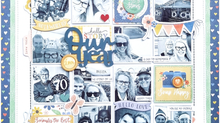
So good to see you again. This time I want to show you the blending effect it can have when you match your papers with the title you use.

In the March Fox Box you find that frosted yellow "true friend" title. I love the frosted colors, it's soft and delicate. I wanted to "blend" that colour with my papers and embellishments for a subtle look.

When I start a project I first pick the title and then the photo I want to use with that title. Then I decide which collection I think fits that photo and title. It's a choice to let your title pop (when it has a contrasting colour) or blend it (by using matching colours in your papers). I do not have a preference, but love both options.

I also used the paper snips in the March Fox Box, they matched the papers perfectly! I chose to do some stitching on the diamond shapes I created. On the blue ones I followed the pattern of the paper and on the yellow ones I simply stitched the edges.

I did a bit of stamping in the background an finished it all off with some clear pearl drops. I hope you like it and got some inspiration out of it!
Thanks so much for stopping by!
xoxo
Petra


Comments